Tarisel Text

EsadType

Gerard Unger Merit Award

Project overview • Dissertation • Specimen

Tarisel Text is the heart of my EsadType graduation project. My goal was to create a hybrid-gothic text typeface that is relevant to contemporary graphic design. In doing so, I sought to translate some of the elements and tone of gothic writing—without falling into any calligraphic clichés.

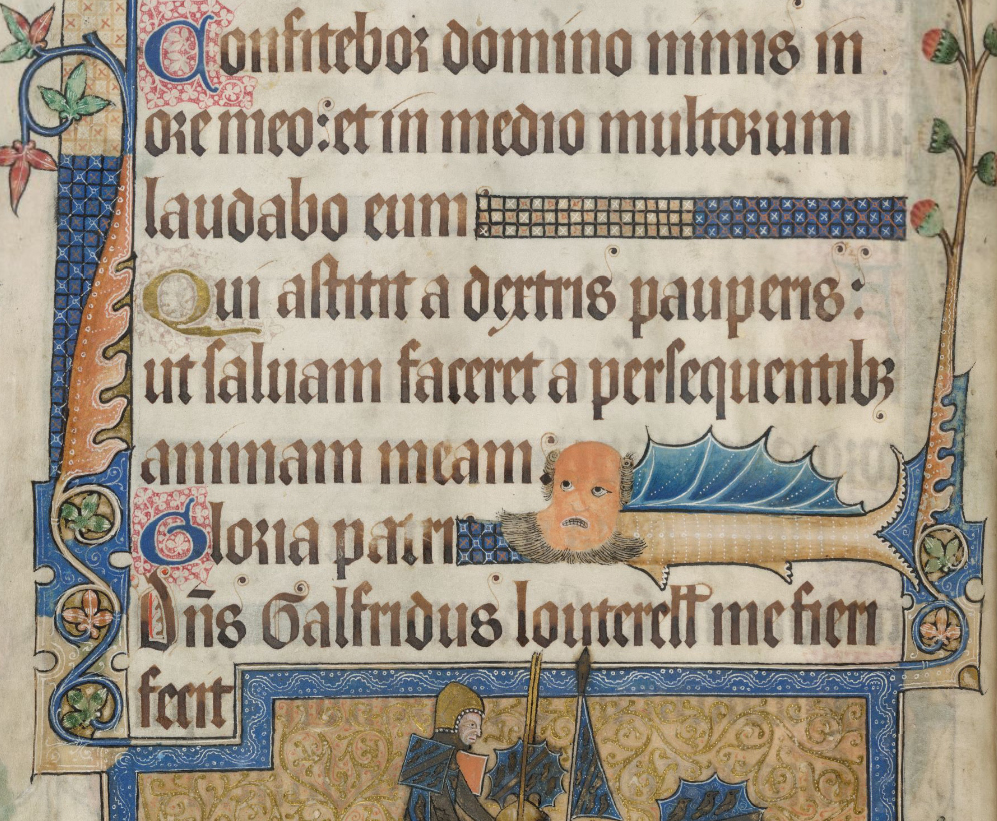
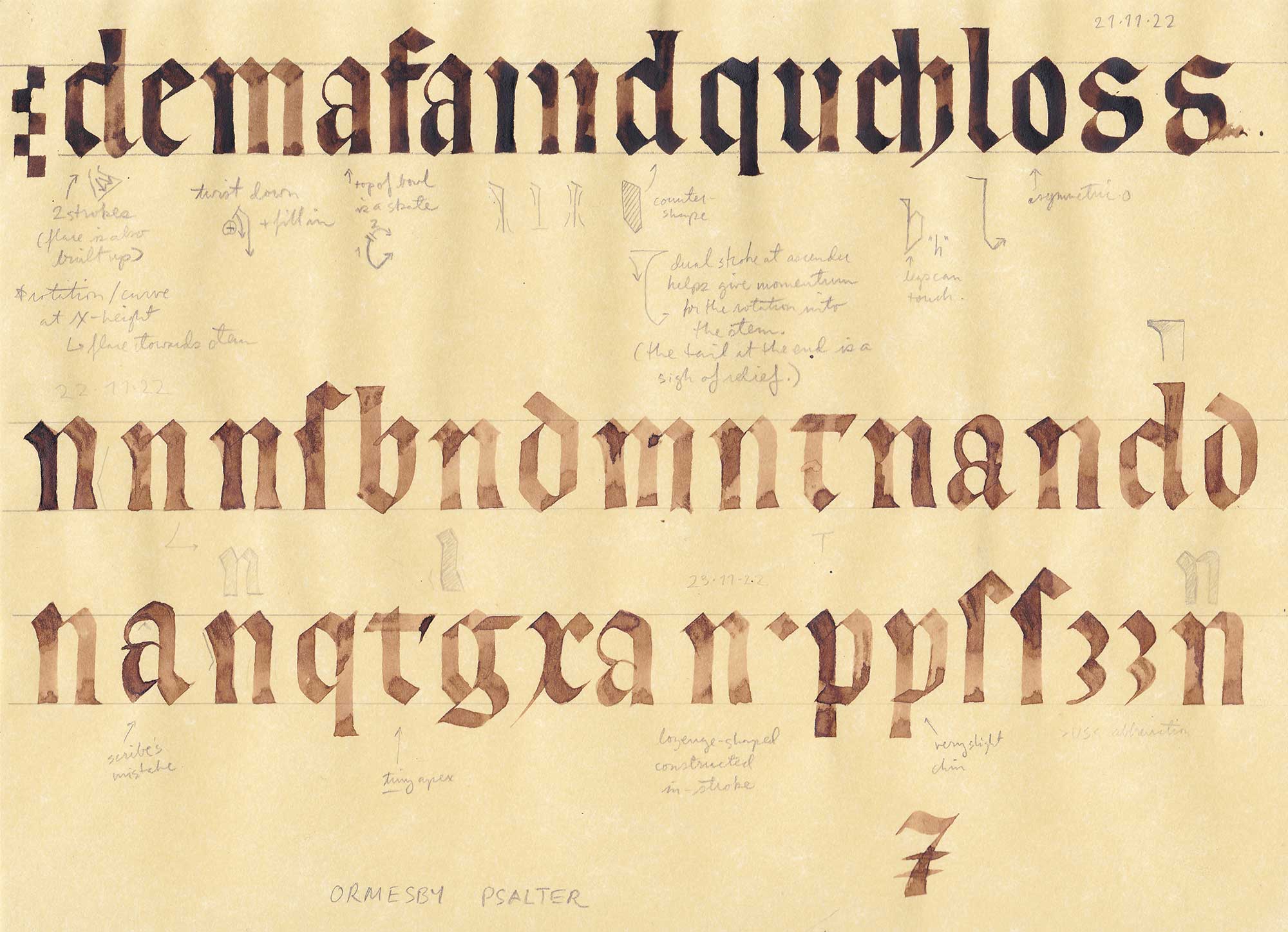
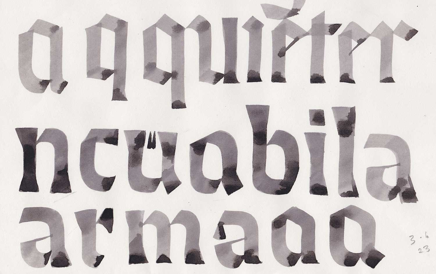
Starting from a particular 13th-century English book hand, Tarisel Text is a hybrid in more ways than one: it bridges gothic and roman, sans and serif, text and display, ancient and modern, making it surprisingly versatile. Over the course of the project, I did a deep dive into a little-known writing style, fell in love with flat brush calligraphy, and found my voice as a type designer. I also learned that there is a lot of ground between gothic and roman styles—so much that this typeface spawned two offshoots: Tarisel Lombardic and Tarisel Hybrid.

Tarisel Text Hairline

A B C D E F G H I J K L M N O P Q R S T U V W X Y Z a b c d e f g h i j k l m n o p q r s t u v w x y z ß . , : ; ¡ ! ¿ ? ‘ ’ “ ” ' " ′ ″ ‹ › « » _ - – — · • / | \ ( ) [ ] { } & † ‡ ¶ @ ° 0 1 2 3 4 5 6 7 8 9 # + − × ÷ = Á À Â Ä Ã Å Ç É È Ê Ë Đ Í Ì Î Ï İ Ñ Ó Ò Ô Ö Õ Ø Ú Ù Û Ü á à â ä ã å ç é è ê ë ğ í ì î ï ñ ó ò ô ö õ ø ú ù û ü ff fi fl ft ffi ffl Th

Tarisel Text Medium

A B C D E F G H I J K L M N O P Q R S T U V W X Y Z a b c d e f g h i j k l m n o p q r s t u v w x y z ß . , : ; ¡ ! ¿ ? ‘ ’ “ ” ' " ′ ″ ‹ › « » _ - – — · • / | \ ( ) [ ] { } & † ‡ ¶ @ ° 0 1 2 3 4 5 6 7 8 9 $ £ # % + − × ÷ = Á À Â Ä Ã Å Ç É È Ê Ë Đ Í Ì Î Ï İ Ñ Ó Ò Ô Ö Õ Ø Ú Ù Û Ü á à â ä ã å ç é è ê ë ğ í ì î ï ñ ó ò ô ö õ ø ú ù û ü ff fi fl ft ffi ffl Th IJ

Tarisel Text Ultra

A B C D E F G H I J K L M N O P Q R S T U V W X Y Z a b c d e f g h i j k l m n o p q r s t u v w x y z . , : ; ¡ ! ¿ ? ‘ ’ “ ” ' " ′ ″ ‹ › « » _ - – — · • / | \ ( ) [ ] { } † ‡ ¶ ° 0 1 2 3 4 5 6 7 8 9 ff fi fl ft ffi ffl Th

Tarisel Italic Hairline

A B C D E F G H I J K L M N O P Q R S T U V W X Y Z a b c d e f g h i j k l m n o p q r s t u v w x y z . , : ; ! ? ‘ ’ “ ” ' " ‹ › « » _ - – — / \ ( ) [ ] { } 0 1 2 3 4 5 6 7 8 9

Tarisel Italic Medium

A B C D E F G H I J K L M N O P Q R S T U V W X Y Z a b c d e f g h i j k l m n o p q r s t u v w x y z . , : ; ! ? ‘ ’ “ ” ' " ‹ › « » _ - – — / \ ( ) [ ] { } 0 1 2 3 4 5 6 7 8 9

The whole project revolves around the wedge serif text style, and the majority of the conceptual heavy lifting took place in developing the medium weight. During this process, I came up with an auxillary serif typeface that references the Lombardic display face. The italic was less of a conceptual concern than a logistical one, dictated by the need for a secondary style in editorial and exhibition applications.

This is the Luttrell Psalter. Produced in the early 14th century, it is perhaps the finest example of a formal style of gothic handwriting called textura prescisus. ‘Prescisus’ means ‘cut off’, referring to the lack of diamond-shaped outstrokes. This style caught my eye years ago and, ever since, I have been fascinated with the dynamic of tension between the sawtooth x-height and the tidy baseline.

Another name for textura prescisus is ‘sine pedibus’, meaning ‘without feet’ because, compared to textura quadrata, whose vertical strokes are finished with an angled penstroke shoe, the foot terminals of textura prescisus are formed by rotating the pen 40° until it is horizontal or by retouching the stroke ending so that it sits on the baseline. In other words, textura prescisus is a medieval sans serif.

As much as I like medieval manuscripts, gothic style is kind of scary to most people out there. I was going to need to do some interpretation, but how? I found inspiration in the Arts & Crafts movement, where artists like William Morris were adapting gothic aesthetics for their day and age.

I began by doing a stroke-by-stroke study of three key manuscripts from my body of research. After all, you need to learn the rules in order to know how to break them. In doing so, I gleaned valuable insights into the construction, stroke order, and gestures involved in writing textura prescisus.

It turns out that textura prescisus is extremely labor-intensive because every letter involves challenging pen movements, retouching, or both. Rotating the pen towards the baseline creates flared feet, but this requires a lot of control and is difficult to pull off on a small scale. Retouching the feet is more exact, but it can also lead to serif-like shapes that protrude from the stems. It seems that many scribes didn’t know when to stop and started retouching other parts of letters, creating compound instrokes and ascenders that are not possible to draw in one stroke.

I embarked on an extensive phase of sketching and experimentation with different tools, including quills. Unlike a broad steel nib, a quill is supple and allows for some interesting articulation. After two or three months, I had been immersed in textura prescisus long enough that I could do my own interpretation, using a flat brush to round out the angles, exaggerate the twists, and create compound structures.

The story of how I got from digitized calligraphy to a highly-refined text typeface has as many twists and turns as a page of textura prescisus. I had struck gold; the more I drew, the more ideas I had.

The biggest lesson that I learned at EsadType was in art direction. I used two strategies to come up with the text face: a top-down and a bottom-up approach. First, I started off with some overwrought calligraphy and reduced it into a singlular system. After months of removing features, the results were still too lavish, so I took a new stance and stripped the design down to the bare minimum, a rotunda-esque low-contrast sans serif. Then, I added features back in, one by one, until I had just the right mix.

All in all, I found that each method had its merits: the reductive approach helped me come up with original shapes, while the additive approach helped me fine-tune the typographic image as a whole.

For several months, I put the wedge serif design on the back burner as I explored hybridization by means of a half-wedge, half-serif design. At one point, I saw this sequence of letters and I realized that there was a whole typeface of material in just the top half.

In the end, I chose to express hybridization within a single vocabulary of shape, which allowed me to dial in a precise formula: a gently flared baseline, jagged x-height, and top-heavy ascenders.

I didn’t set out to draw another Fanfare or Albertus, but the influence is plain to see. The ‘a’ is particularly emblematic of the balance of organic and crystalline structures that originated from using a flat brush.

Unlike the lowercase, which was fairly self-contained, the uppercase was cobbled together from a diverse set of references: an inscription here, a calligraphic experiment there. This allowed me to explore themes of savageness and redundancy on a larger scale.

The ‘t’ is Tarisel’s most iconic shape. It’s a product of the feedback loop between the text and Lombardic typefaces. Lombardic capitals often have an uncial ‘T’ with a built-up apex. I drew this shape in the capitals long before the text had come about. Months later, I realized that this structure from the Lombardic ‘T’ fit the vocabulary of built-up instrokes in the lowercase perfectly. Although it was a lot of work to develop multiple concepts in parallel, moments of synergy like this made it all worthwhile.

The lowercase ‘j’ is one of my favorite letters from this typeface. I’ve never drawn anything quite like it before, and it packs a lot of punch into not a lot of horizontal space. I’d draw that again.

The italics were more of a typographic necessity than a central theme. There was so much to explore in the text styles that I didn’t feel the need to dwell on the design of the secondary style. I was satisfied to make an oblique version and modify a few letters. I think that a more distinct italic would be worth exploring, but in the meantime, the oblique has its own charm.