Tarisel Lombardic

EsadType

September 2022 – March 2024

Gerard Unger Merit Award

Project overview • Dissertation • Specimen

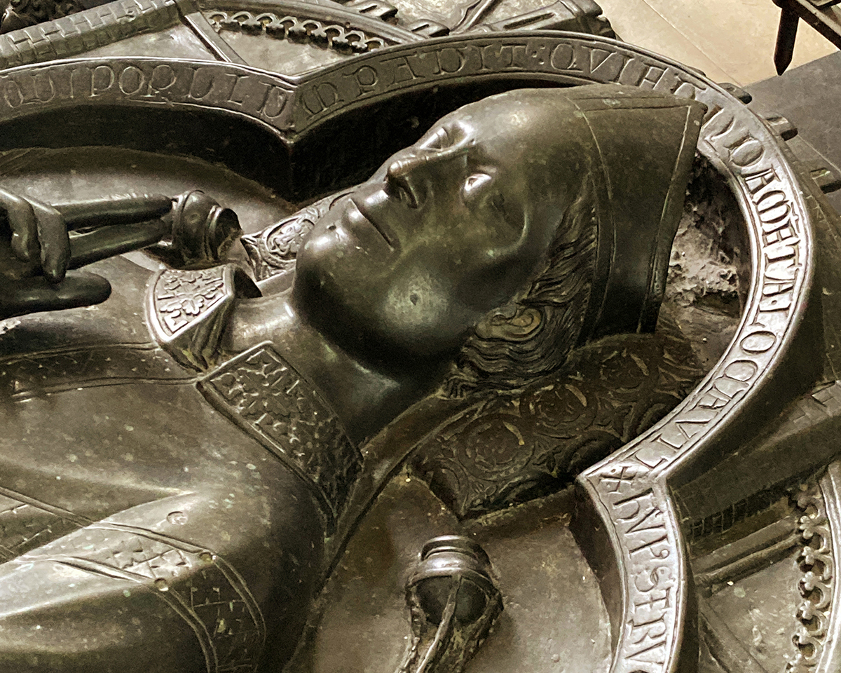
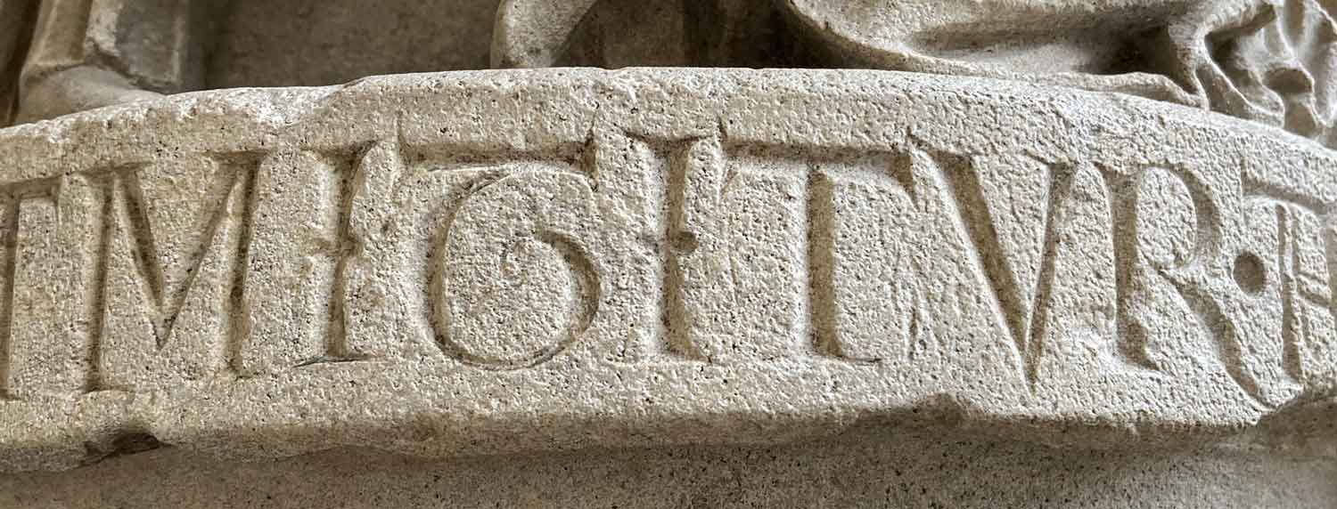
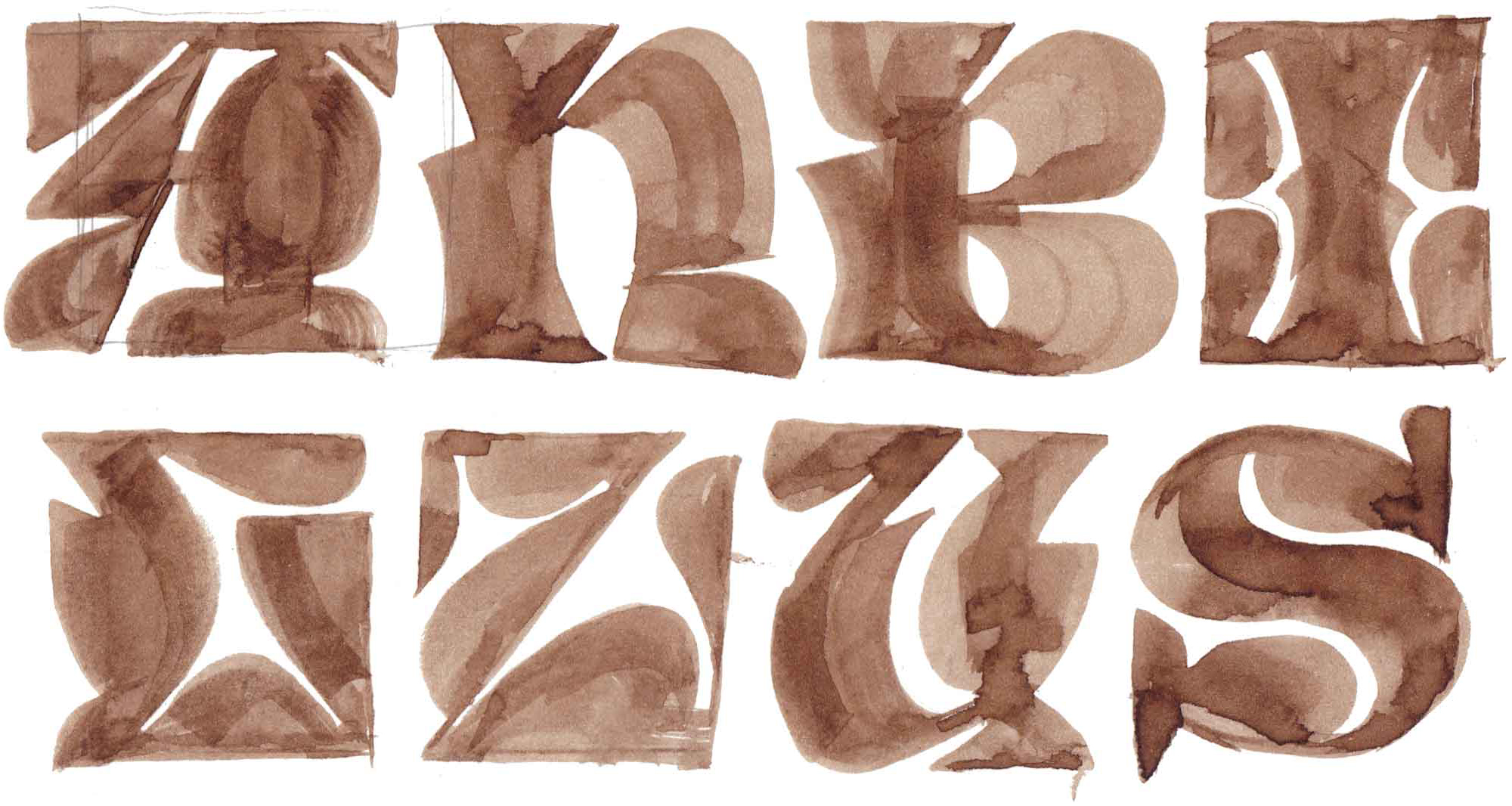
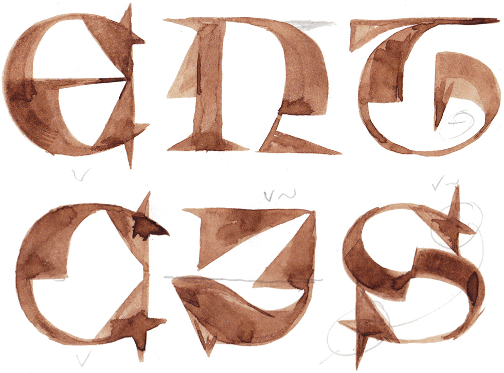
Tarisel Lombardic is the second half of my EsadType graduation project. My goal was to create a typeface that embodies the grotesque caricatures found in medieval art, and to make Lombardic capitals more relatable to contemporary designers and audiences.

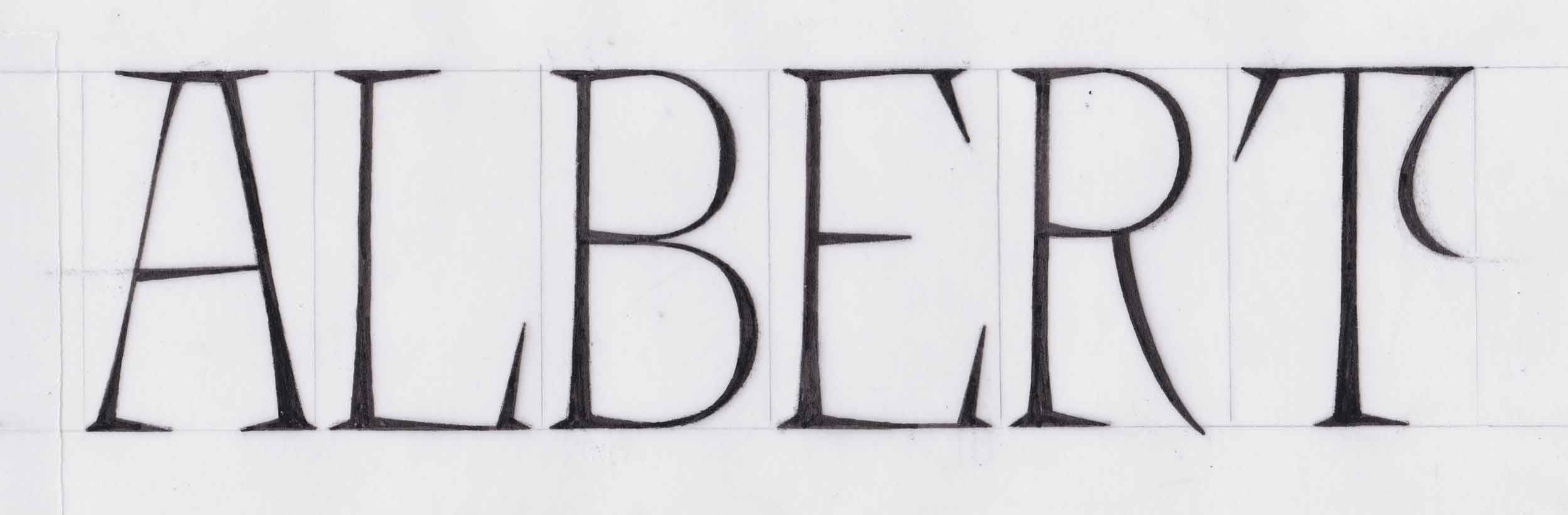
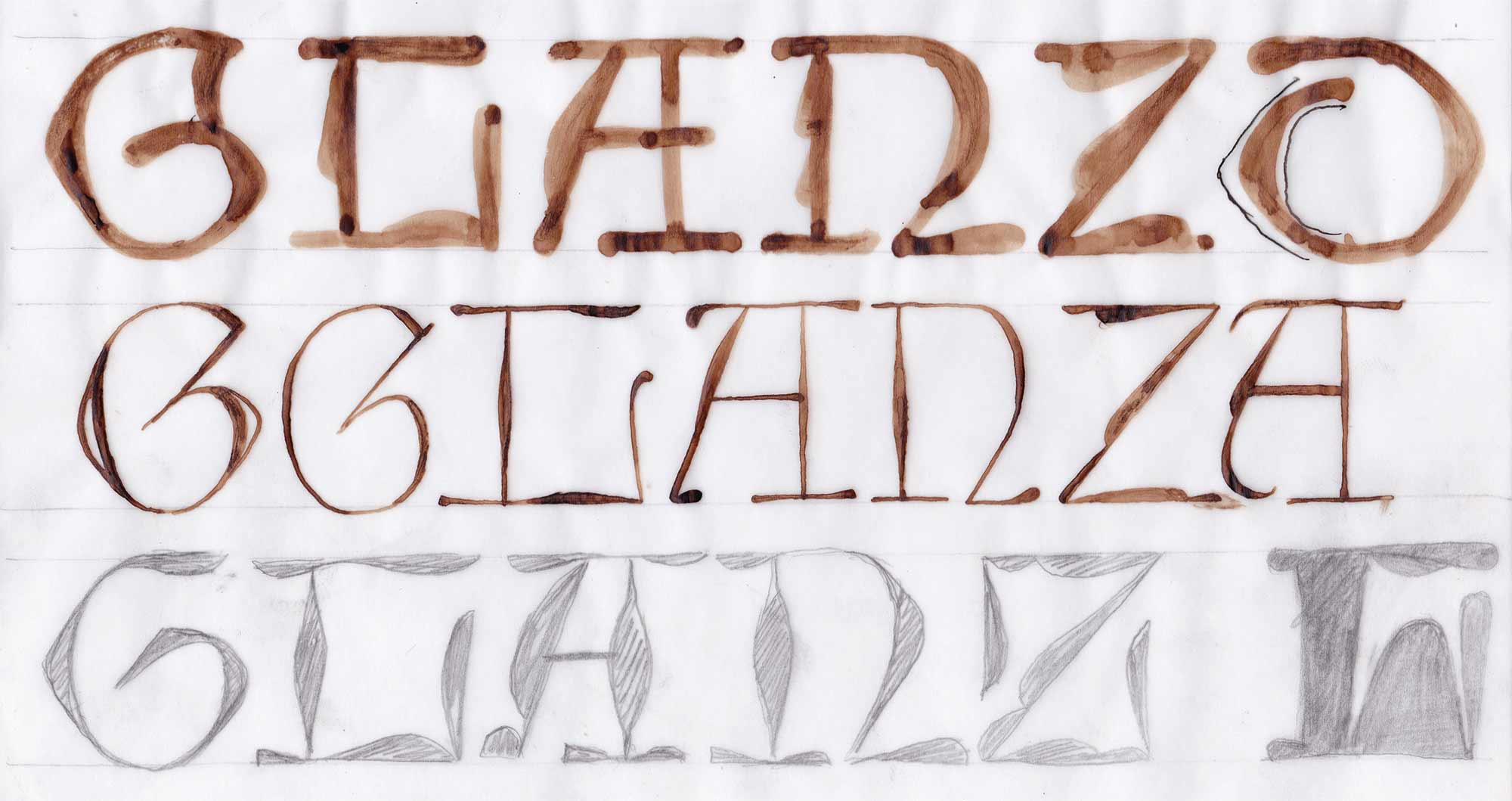
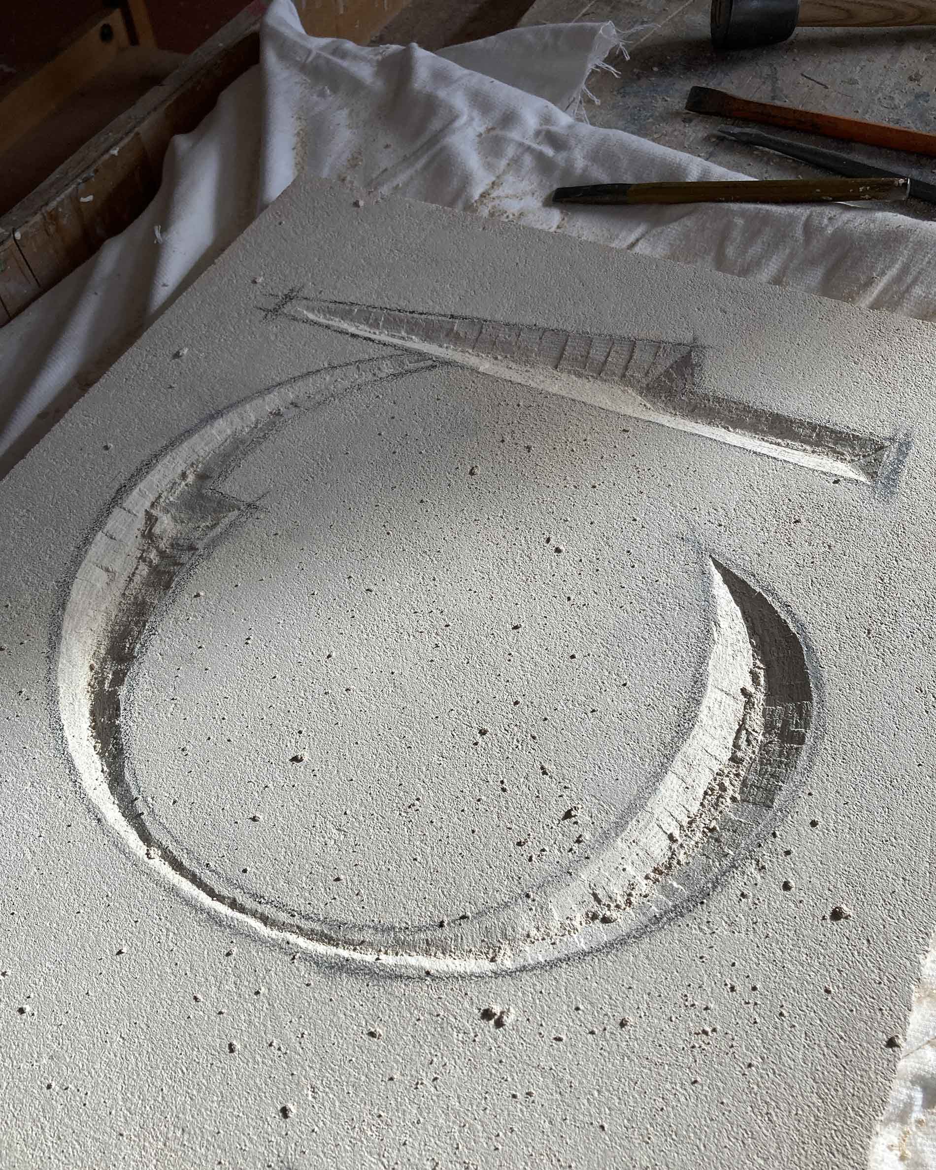
A digital adaptation of gothic versal lettering, Tarisel Lombardic was inspired by French inscriptions and manuscripts from the 13th century. I used traditional versal construction as a starting point to explore the relationship of outline and counterform. From there, I continued to investigate plasticity of construction and proportions. Tarisel Lombardic was also my first time designing a display typeface. It was gratifying to break free from the constraints of legibility and focus on building a visual bridge between the middle ages and the present day.

The development of the Lombardic display capitals was intertwined with that of Tarisel Text and Hybrid. Over the course of the project, my focus shifted back and forth several times, and each time the concept became clearer. The text and display components created a feedback loop: having a separate display typeface gave me an outlet for ideas that would have been too much for the text typeface. It also served as a testing ground for new shapes and some of them made their way back into the text typeface.

Tarisel Lombardic Wide Light

A B C D E F G H I J K L M N O P Q R S T U V W X Y Z A B C D E F G H I K M N P R S T U W X A D E G H I M N S T W A D E H I M NN S T W A D E H I M NN S T W H S T W S T 1 2 2 3 3 4 5 6 7 8 9 0 . : : · . : : · ¶ † ‡ † ‡

Tarisel Lombardic Wide Black

A B C D E F G H I J K L M N O P Q R S T U V W X Y Z A C D E F G H I K M N P R S T U W X A B D E G H I M N T W A D E H I M NN S T W D E H I M NN T W H S T W S T 1 2 2 3 3 4 5 6 7 8 9 0 . : : · . : : · ¶ † ‡ † ‡

Tarisel Lombardic Condensed Light

A B C D E F G H I J K L M N O P Q R S T U V W X Y Z A B C D E F G H I K M R S T U W X A D E G H I M N R T W A D E H I M NN T W D E H I M T W H T W T . : : · . : : · ¶ † ‡ † ‡

Tarisel Lombardic Condensed Black

A B C D E F G H I J K L M N O P Q R S T U V W X Y Z A C D E F G H I K M R S T U W X A B D E G H I M N W A D E H I M NN T W D E I M T T . : : · . : : · ¶ † ‡ † ‡

It all started here: at the effigy of Évrard de Fouilloy in the Cathedral of Notre-Dame d’Amiens. Shortly after arriving in Amiens, I stopped by the cathedral and I fell in love with the lettering on this amazingly well-preserved 13th-century bronze sculpture. This was my first contact with inscriptional Lombardic capitals, and it is what gave me the idea to research gothic lettering in greater detail. I was particularly impressed by the clarity and consistency of these structures, and that the engraved letters are much lighter than many illuminated versals.

Built during the same era, the north portal of Notre-Dame de Chartres features a few inscriptions that are on par with those in Amiens. These letterforms are relatively simple, but feature some variation in construction: there are several inscriptions that have square and and uncial shapes side-by-side, creating some unique word images. I was also impressed by the way that the ornamentation and punctuation controls the white space.

I became fascinated with the issue of proportions in Lombardic versals: they are stretched, compressed, and distorted to fill a box. While doing TypeCookers, I encountered the monospace parameter a few times, which caused me to reflect on the elements of gothic style in a different light. In this case, I started with roman constructions, squashed them to fit into the available space, and exaggerated the sharp features, giving them a savage appearance. I now had all of the ingredients—I just needed to create the recipe.

I noticed that many gothic capitals feature an oval-shaped counter and diamond-shaped outline, which reminded me of the synthetic expansion contrast in Scotch Roman types. I riffed on this juxtaposition of shapes using a Speedball nib and pointed pen.

The blobby shapes made by overlapping strokes of the Speedball nib sparked my imagination. I took the forms from the previous sketch and built them up until there was almost no white space. I was left with what Frederik Berlaen likes to call “melted chocolate letters”: anything goes, as long as every letter has more or less the same volume.

I took out a new piece of paper and drew a gothic ‘E’. Instead of building up the shape symmetrically on the outside, what if I built it up along only part of the stroke, on the inside? Suddenly, I had a vocabulary of structural ornamentation that embodied the concept of “broken letters”, typically associated with textura. According to Erik van Blokland, I was drawing a Dr. Who typeface.

Early drafts included broken shapes on every letter, as I started to understand how the system would apply across the alphabet. It was easiest for me to begin with the bold, since it allowed me to clearly visualize the contrast and proportions. During ATypI 2023, my colleague Abhijit Menon suggested making a light. The next day, Anna Khorash suggested making a black. I’m glad that I listened to them.

Over the summer, I took a break from my project and it was one of the best things I did. When I came back from break, I could see the design with fresh eyes and I realized that it was necessary to take a close look at the proportions. Instead of adjusting letters one by one, I made a monospaced version. This allowed me to quickly visualize which letters needed adjustment. It had the added benefit of helping me find a way to effectively distribute weight across each letterform. In the end, I thought that it was more compelling to give the alphabet exaggerated proportions that hint at unified width than to create a true monospace.

It took a lot of experimentation to define the rhythm of the typeface. By the time I had gotten the basic system under control, I had a surplus of extra letters kicking around. In most cases, it makes the design stronger to go with one solution, but in this case it helped to play around with all kinds of constructions without getting hung up on which one was supposed to be right. I was also surprised by how useful it was to have plenty of alternates to choose from to break up the monotony of a wall of text.

This typeface is all about playing with the counters. The weight and width axes highlight the effect of the structural ornamentation on the counterspaces.

Working with some unconventional structures, I had to make significant alterations to certain letters to manage the white space evenly in different corners of the designspace.

A historical feature as well as a clever way to manage space, three-dotted punctuation can help to create an uninterrupted, dazzling texture.

Given the inscriptional origins of the typeface, I took the opportunity to learn stonecarving. I wish that I had started earlier so that I could have used stone as a medium for developing the vocabulary of shapes. Nevertheless, it was satisfying to take a digital letter produced by interpolation and give it tangible, three-dimensional form. It was a revelation to visualize the centerline of the broken shapes, created by multiple brushstrokes, as it was highlighted by the converging faces of light and shadow.