Tarisel Hybrid

EsadType

September 2022 – March 2024

Gerard Unger Merit Award

Project overview • Dissertation

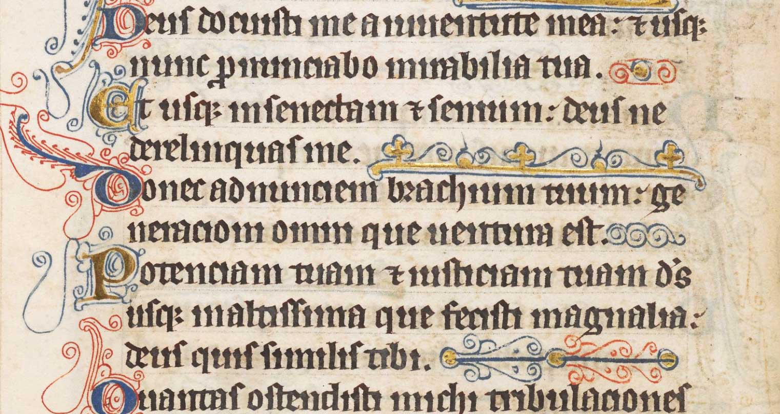
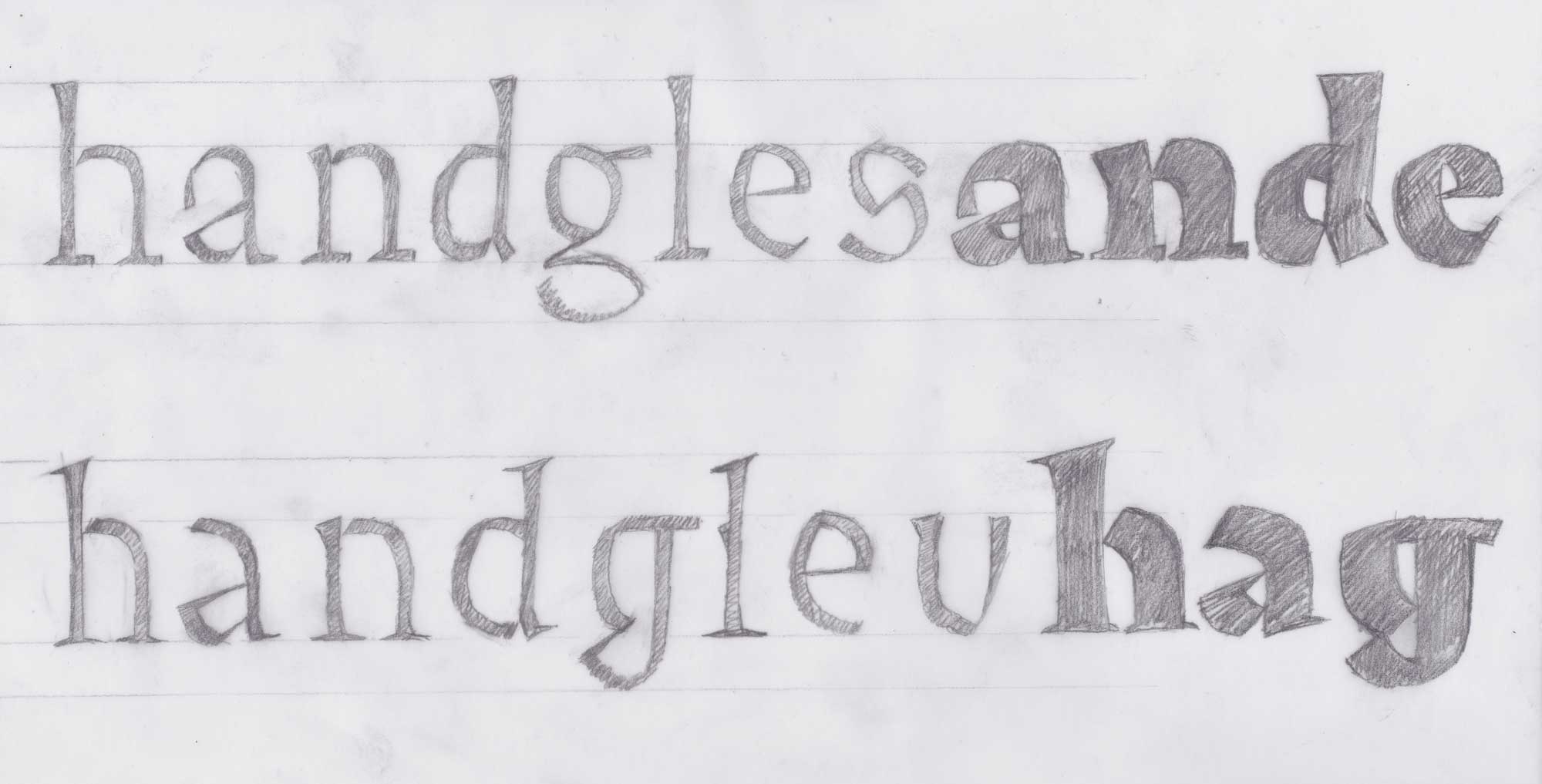
Tarisel Hybrid is one of the text typefaces from my EsadType graduation project. In the beginning, it was the main focus of my research. It is also the missing link between Tarisel Text and Tarisel Lombardic. My vision was to make a hybrid-gothic text typeface that was so homogenous that would integrate its roots into a seamless texture. As it turns out, that is hard to do. Along the way, I toyed with the idea of making a Frankenstein: Tarisel Hybrid.

Tarisel Hybrid Hairline

A B C D E F G H I J K L M N O P Q R S T U V W X Y Z a b c d e f g h i j k l m n o p q r s t u v w x y z ß . , : ; ¡ ! ¿ ? ‘ ’ “ ” ' " ′ ″ ‹ › « » _ - – — · • / | \ ( ) [ ] ¶ 0 1 2 3 4 5 6 7 8 9 Á À Â Ä Ã Å É È Ê Ë Í Ì Î Ï İ Ñ Ó Ò Ô Ö Õ Ø Ú Ù Û Ü á à â ä ã å é è ê ë ğ í ì î ï ñ ó ò ô ö õ ø ú ù û ü ff fi fl ft ffi ffl Th

Tarisel Hybrid Medium

A B C D E F G H I J K L M N O P Q R S T U V W X Y Z a b c d e f g h i j k l m n o p q r s t u v w x y z ß . , : ; ¡ ! ¿ ? ‘ ’ “ ” ' " ′ ″ ‹ › « » _ - – — · • / | \ ( ) [ ] ¶ 0 1 2 3 4 5 6 7 8 9 sÁ À Â Ä Ã Å É È Ê Ë Í Ì Î Ï İ Ñ Ó Ò Ô Ö Õ Ø Ú Ù Û Ü á à â ä ã å é è ê ë ğ í ì î ï ñ ó ò ô ö õ ø ú ù û ü ff fi fl ft ffi ffl Th

Tarisel Text and Hybrid have the same foundation: the same weight, the same width, and the same structure. The Hybrid, however, features slightly higher contrast and foot serifs which increase the letterspacing and create more reticulated counters.

This branch of the project was inspired by textura semi-quadrata. In some ways, I find this relatively hastily-scrawled blackletter more charming than the almost too-perfect prescisus of the Luttrell Psalter. Its inconsistencies are also a treasure trove of ideas. Note how the skeletal baseline strokes contrast with the heavily built-up features on the x-height.

My first response to the notion of a hybrid was to do some freeform sketching and, naturally, I gravitated towards a mashup of wedge and serif shapes, as well as other angular features.

These sketches were a good start, but they were also too predictable. In reference to the mistakes that I saw in my sources, I did the worst brush calligraphy possible in order to generate a whole new vocabulary of grotesque shapes and details.

I spent the next three months creating order out of the madness. I like to think of these rounds of form-based experimentation in terms of the evolution of gothic writing: making a refined, rhythmic structure out of a loose conglomeration of shapes.

The recipe is simple: wedges on top, serifs on the bottom. Apart from the angular instrokes, I tried to solve as many shapes as possible with curves.

The counters are one of the Hybrid’s most distinctive features. In order to avoid sharp corners, I focused on using a variety of curve speeds to create dynamic countershapes. This way, I could give a tip of the hat to broad nib construction without being too literal.

Half wedge, half serif—a dilemma or a feature? It was hard for me to tell, so I split the design in two. The wedge design went on to become the primary text style. The serif design looked great in text, but relied too heavily on the fit and finish to convey the gothic tone. I came out of the experiment with a newfound sense of confidence in the hybrid design. This test also whetted my appetite to continue exploring the gothic-roman continuum. What else is out there?

One of my favorite shapes to come out of the serif experiment was the lowercase ‘g’. This little goblin is what I meant when I said I wanted to give each letter its own personality. If you have letters this flavorful, who needs vignettes and fleurons?

The hybrid design is the missing link between the Lombardic and text styles. Is a hybrid-gothic fantasy superfamily overkill? Will he stop at nothing? Only time will tell. At any rate, I feel satisfied in knowing that each family member fills a niche and expresses hybridization from a different angle while sharing a common visual thread.

This style is such a hodgepodge that I felt free to try out some wild shapes that I wouldn’t have dreamt of drawing in the other styles.

Whereas the text style is a reflection on the finesse of textura, the hybrid style gives new meaning to the term “lettres brisées” with angular constructions and jarring counterforms.