Snack Plate
Snack Plate CreativeJanuary 2024
A wordmark for Megan and Lauren at Snack Plate. It’s fun, it’s hard-working and it’s tasty. Oh, and there’s a miniature, dumpling-shaped typeface for dessert.
January 2024
A wordmark for Megan and Lauren at Snack Plate. It’s fun, it’s hard-working and it’s tasty. Oh, and there’s a miniature, dumpling-shaped typeface for dessert.
Letters or kitchen gadgets? In any case, they’re well-traveled and they’ll design you some cool packaging. Garnished with a sprig of modified Caseback Sans.

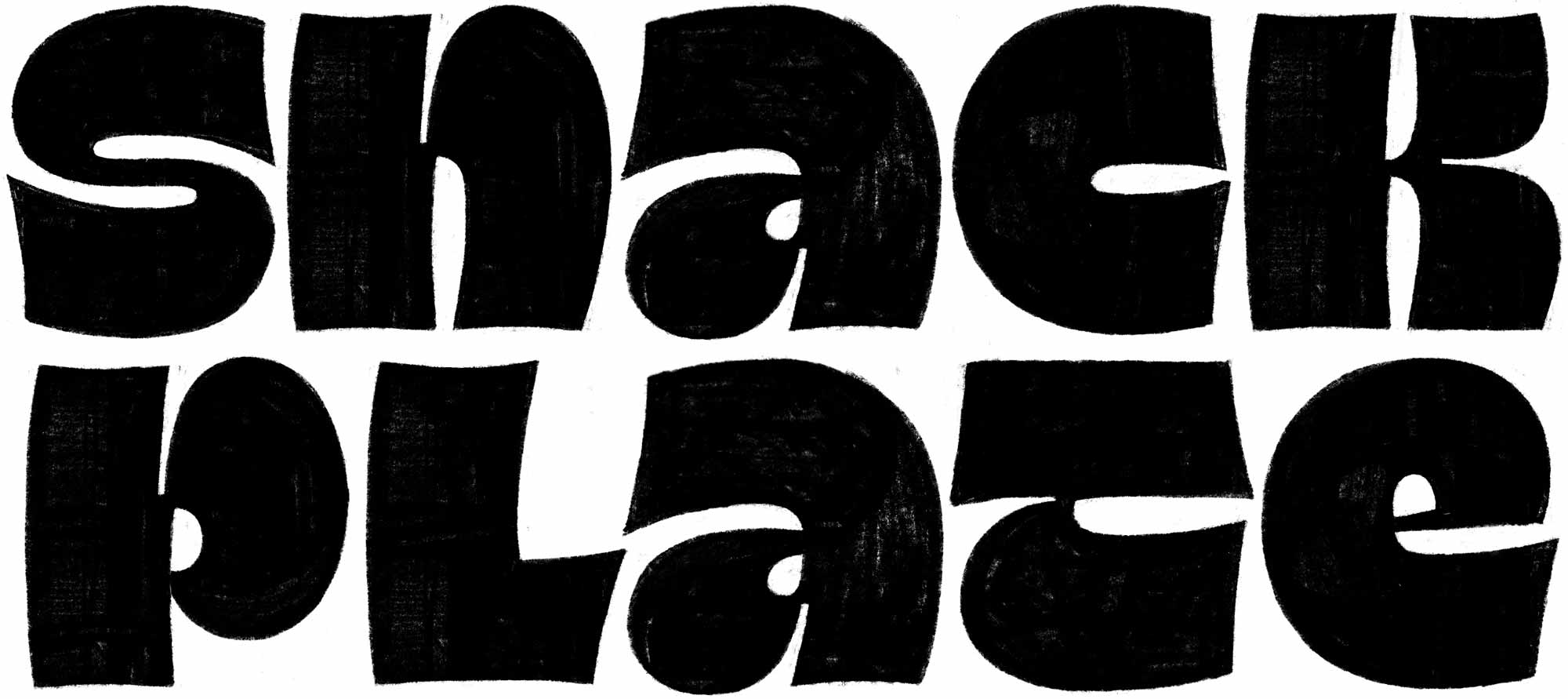
Nothing says ‘fun’ like ultra-heavy reverse-contrast brush lettering. This concept didn’t tell the whole story, but it did get the juices flowing.

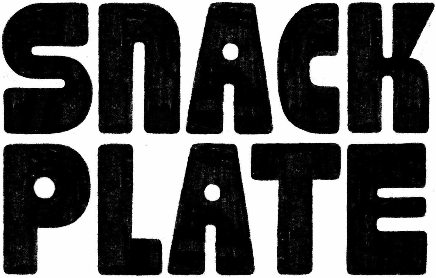
The next thing that sprang to mind was apparently a cross between tiki bar and Art Deco. Hungry yet?

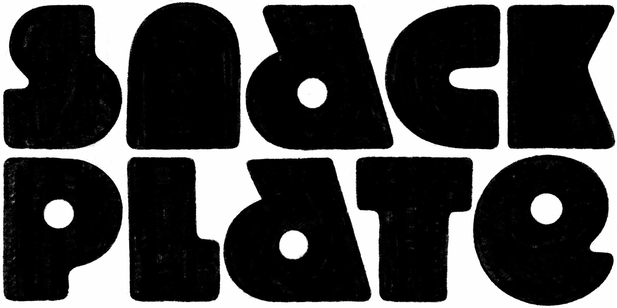
I tried something more relaxed. Who needs counters when you can have bubbles? The loaf capitals didn’t make it into the main course, but they still found their way to the table as a custom font.

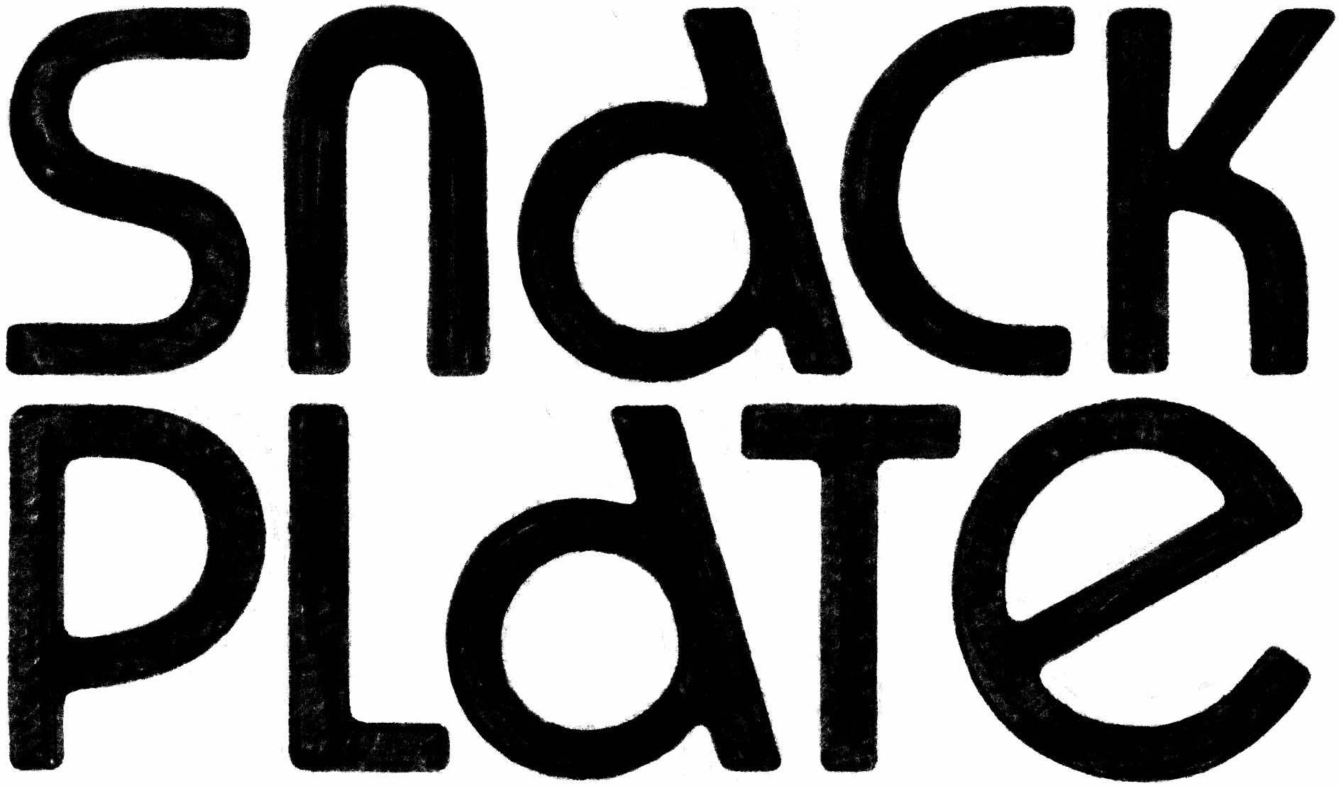
I imagined what those block letters would look like if they were made out of noodles instead of cheese. In addition to the irregular letterforms, I wanted to play a game of proportion and use contrasting widths.