La Reinita

TypeParis

June – July 2022

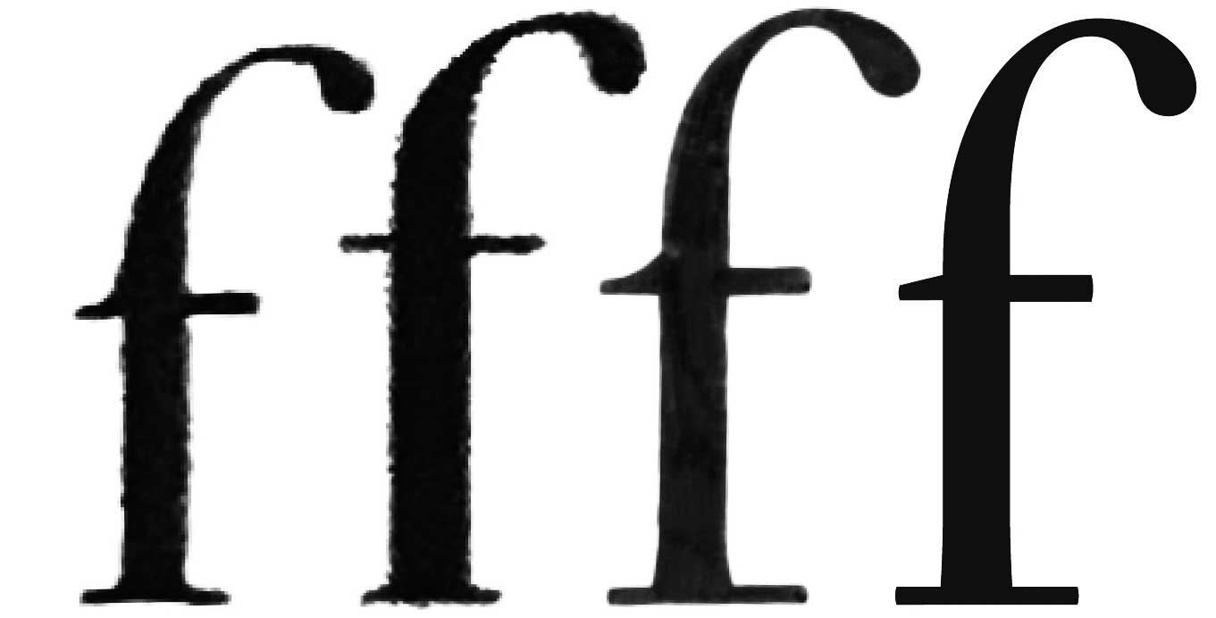
Make a Romain du Roi revival — fast!

La Reinita was drawn in three weeks at TypeParis ’22. This project was pivotal for me. It taught me how to manage a designspace and to trust my eye. It also made me hungry to pursue more original concepts. My time in Paris changed me in many ways, including leading me to study at EsadType.

This project taught me the value of pushing the design space to its limits — and beyond. I also developed an affinity for this bizarre style. After a couple weeks, I didn’t even notice all the extra serifs.

A B C D E F G H I J K L M N O P Q R S T U V W X Y Z Á Â Ä À Å Ã É Ê Ë È Í Î Ï Ì Ñ Ç Ó Ô Ö Ò Õ Ø Ú Û Ü Ù a b c d e f g h i j k l m n o p q r s t u v w x y z á â ä à å ã ç e é ê ë è í î ï ì ñ ó ô ö ò ø õ ú û ü ù æ ff ffi ffl fft fh fi fl ft 0 1 2 3 4 5 6 7 8 9 0 1 2 3 4 5 6 7 8 9 . , : ; ! ¡ ? ¿ · • * / \ - – — _ ( ) { } [ ] ‘ ’ “ ” ' " « » ‹ › $ €
a b c d e f g h i j k l m n o p q r s t u v w x y z ff fh fi fl ft

What is the Romain du Roi? Do do you reference the descriptions of Jaugeon committee, Simmoneau’s engravings, or the metal type? I tended towards the text types cut by Grandjean, although I also stook some cues from Luce’s display cuts.

One detail that struck my fancy was the overly-heavy crossbar on the ‘A’. At first, I thought this must have been some kind of mistake, but eventually I saw that it is actually a brilliant way to distribute the weight across the letter. Whether this was intentional or not, I can’t say. I do know that if I were to approach this design again, I would spend less time recreating historically-accurate details and more time playing with radical solutions like this.

The lowercase ‘l’ is my favorite character from the Romain du Roi—it says so much about the logic that plagues the design. Bilateral serifs make one letter look like another? Why not solve the problem by creating more problems? This backwards mindset goes fundamentally against my instincts and, at the same time, it helped me loosen up and learn that I don’t have to take everything so seriously.

I resisted the urge to override the inconsistencies. The modulation of thick strokes on the lowercase ‘e’ became central to the patterning. Quirks like this are part of what make the Romain du Roi so interesting.

Since the text and display cuts were so different from each other, I made a unified structural interpretation and pushed the contrast to the extremes to simulate a range of optical sizes. I think that the Romain du Roi pattern has potential as a delicate display type and as a rugged slab serif.

Grandjean cut an amazing set of text figures. With such a lively source, I opted to start with the oldstyle figures and adapt them for the lining set.