Marlon

EsadType

September – December 2022

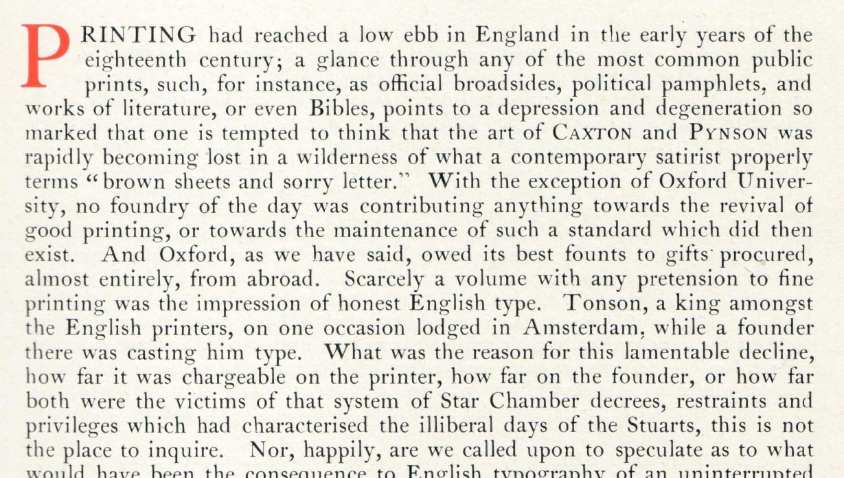
Marlon is a revival of a revival. My first assignment at EsadType, I had to interpret a typeface of my choice from a Caslon specimen published in the early 20th century. The only rule was that I could only draw in the font editor, without any background images. This came as a challenge since I usually rely heavily on pen and paper to hammer out a concept.

To keep things interesting, I selected a 9pt cut that bore little resemblance to the types cut by William Caslon I. In fact, it looked more like something from an ATF catalog of the same vintage. I thought it was terrible. Detached from any delusions of grandeur, I felt free to explore some new shapes and go against my preconceptions of how Caslon is supposed to be.
Marlon Regular

A B C D E F G H I J K L M N O P Q R S T U V W X Y Z Á Â Ä À Å Ã É Ê Ë È Í Î Ï Ì Ñ Ç Ó Ô Ö Ò Õ Ú Û Ü Ù a b c d e f g h i j k l m n o p q r s t u v w x y z á â ä à å ã ç é ê ë è í î ï ì ñ ó ô ö ò õ ú û ü ù fi ffi 0 1 2 3 4 5 6 7 8 9 0 1 2 3 4 5 6 7 8 9 . , : ; ! ¡ ? ¿ · • / \ - – — _ ( ) [ ] { }

Marlon Condensed

A B C D E F G H I J K L M N O P Q R S T U V W X Y Z Á Â Ä À Å Ã É Ê Ë È Í Î Ï Ì Ñ Ç Ó Ô Ö Ò Õ Ú Û Ü Ù a b c d e f g h i j k l m n o p q r s t u v w x y z á â ä à å ã ç é ê ë è í î ï ì ñ ó ô ö ò õ ú û ü ù 0 1 2 3 4 5 6 7 8 9 . , : ; ! ¡ ? ¿ · • / \ ( ) [ ] { }

The biggest lesson that I learned was about spacing. Overall, my source was spaced much looser than I would tend to space 9pt type. Whether this is an artifact of the design or the justification, I am not sure. In any case, it made me think more critically about the color produced by my drawings.

The source material featured a lowercase ‘a’ with an extremely square shoulder. Not only was this a major departure from the original Caslon types, but it also went against my instinct of using the letter ‘n’ as a template. In order to preserve the proportions, I had to treat it as a completely different shape, opening the door for some variation in patterning.

This project offered me an opportunity to approach some letters from an entirely new perspective. The elongated link of the ‘g’ was uncomfortable at first, but it worked great in text, giving the letter a little extra buoyancy.

Drawing from the lessons that I learned from the ‘a’ and ‘g’, I ran with the idea of sprinkling the typeface with variety. Usually, I would tend to homogenize the appearance of the terminals. Instead, I chose to adapt each one to complement its respective letter.

For me, the ‘b’ is one of the most iconic shapes from the original Caslon types. This is one of a few traces of the ‘goût hollandais’ that made it unscathed into the 19th-century interpretation. I made sure to build this counterform into the drawing.

Up until this point, I hadn’t fully considered the utility of adapting certain constructions to different ends of the designspace. I used the source’s asymmetrical ‘C’ for the regular width, but it was much more practical to use the classic, symmetrical construction for the narrower widths.

Not every letter needs to be polite. Early on, I tried to tuck in the leg of the ‘R’ to balance its counterspaces, but it lost its personality. In this case, the unbalanced distribution of space strengthened the letter and the word image as a whole.

I like a good set of oldstyle figures. I find that taking the time to make a distinct oldstyle set allows me to mature the design of the lining figures. I also find that they help me to see some features of the lowercase more clearly. Frivolous? Worth it.