Larrabee Lager
→ Snack Plate Creative
→ Brooke Fitts Photography
The logo for Larrabee Lager Co. is one of my most expansive lettering projects to date. Normally, I like to iterate on an idea, but this time I went full goblin mode and cranked out 40 versions in 2 months. The final design was not at all what I imagined when the project began, but I enjoyed the process so much that it didn’t matter to me which one came out on top.
So much material ended up on the cutting room floor that, every once in a while, I go back and dig through my sketches for inspiration. I have outgrown many of them, but sometimes a sketch catches my eye and makes me want to revisit it. For example, Psalicorne started as a draft for the Larrabee wordmark that eventually took on a life of its own.
This project came about during an exciting moment of my life. I was new to doing custom lettering, so the sketches that appeared on my iPad looked as though they were being drawn by someone else. I also have fond memories of sketching on the train to TypeParis and fine-tuning the wordmark during my first month in Amiens for EsadType. Doing lettering commissions while studying type design was a dream come true.
My favorite thing to hear as a designer is “do your thing.” I didn’t have complete free reign on this project, but I did have license to explore some very diverse themes. Snack Plate asked me for three directions to break the ice: blackletter, baseball, and vintage Pacific Northwest. I gave each concept everything I had at the time. I’m glad that I went all-out because Larrabee got a proper logo out of the deal—and I got a ton of cool ideas.
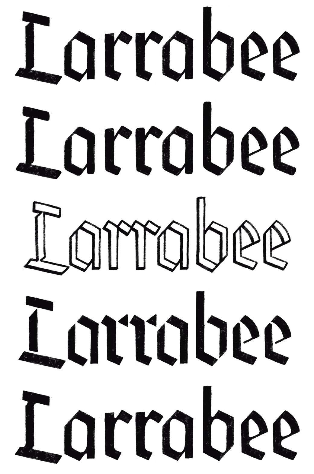
I started off with a generic blackletter—the kind of thing you would expect to see on an American beer can. Instead of proposing something historical right off the bat, I wanted to see if I could tell the story using ambiguous structures and an assortment of contemporary finishes. I especially like the stencil version that borders on abstraction.
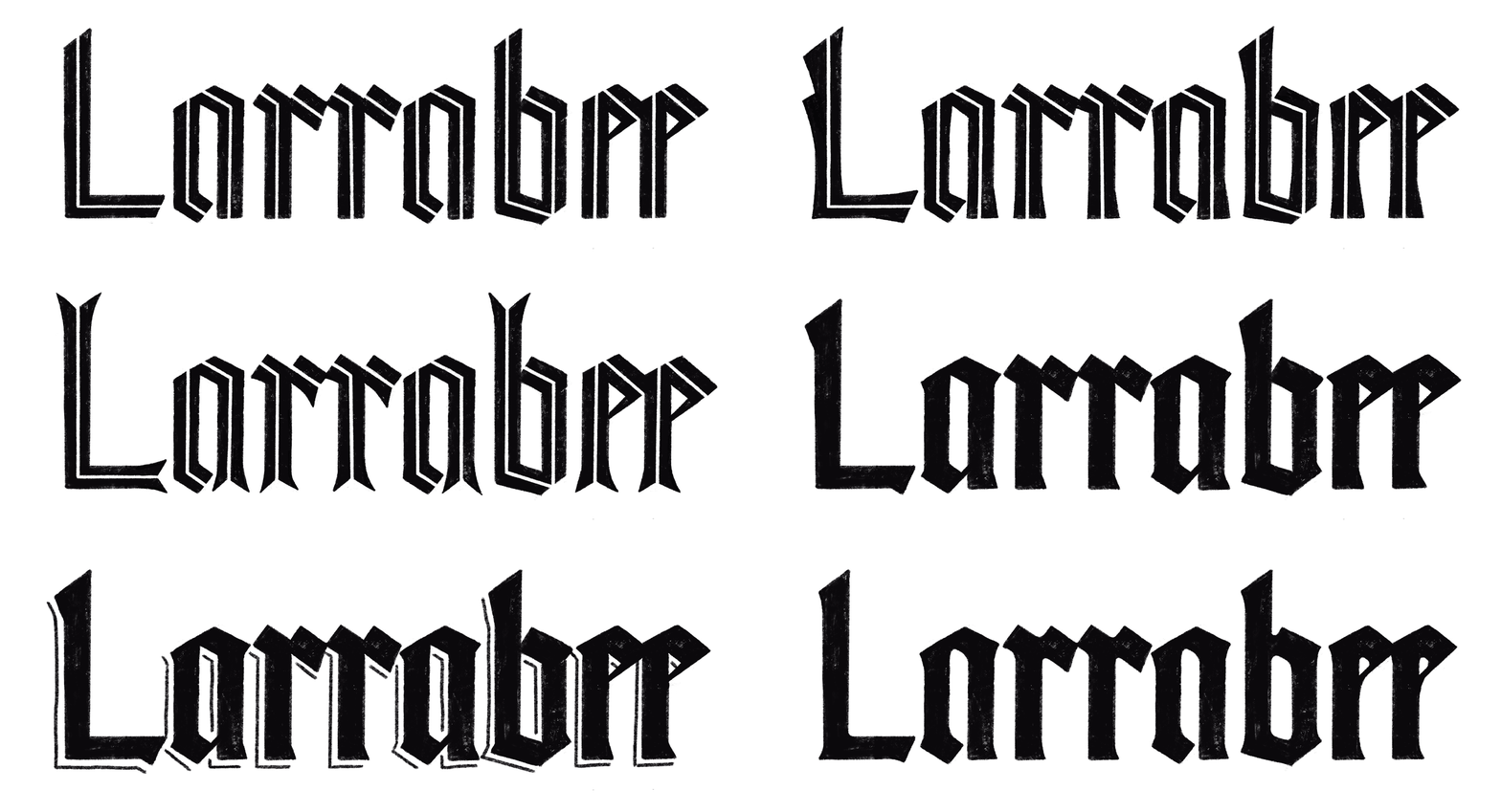
I couldn’t help but propose textura prescissa, drawn from my calligraphic practice. At the time, I would fill pages and pages with quadrata or prescissa in search of the perfect textura picket fence. The idea here was that a historical sans-serif model would suggest both tradition and modernity. Or maybe I just wanted an excuse to draw my favorite littera formata. The inline version went on to become Psalicorne. My favorite is the one with the forked feet—more on that later.
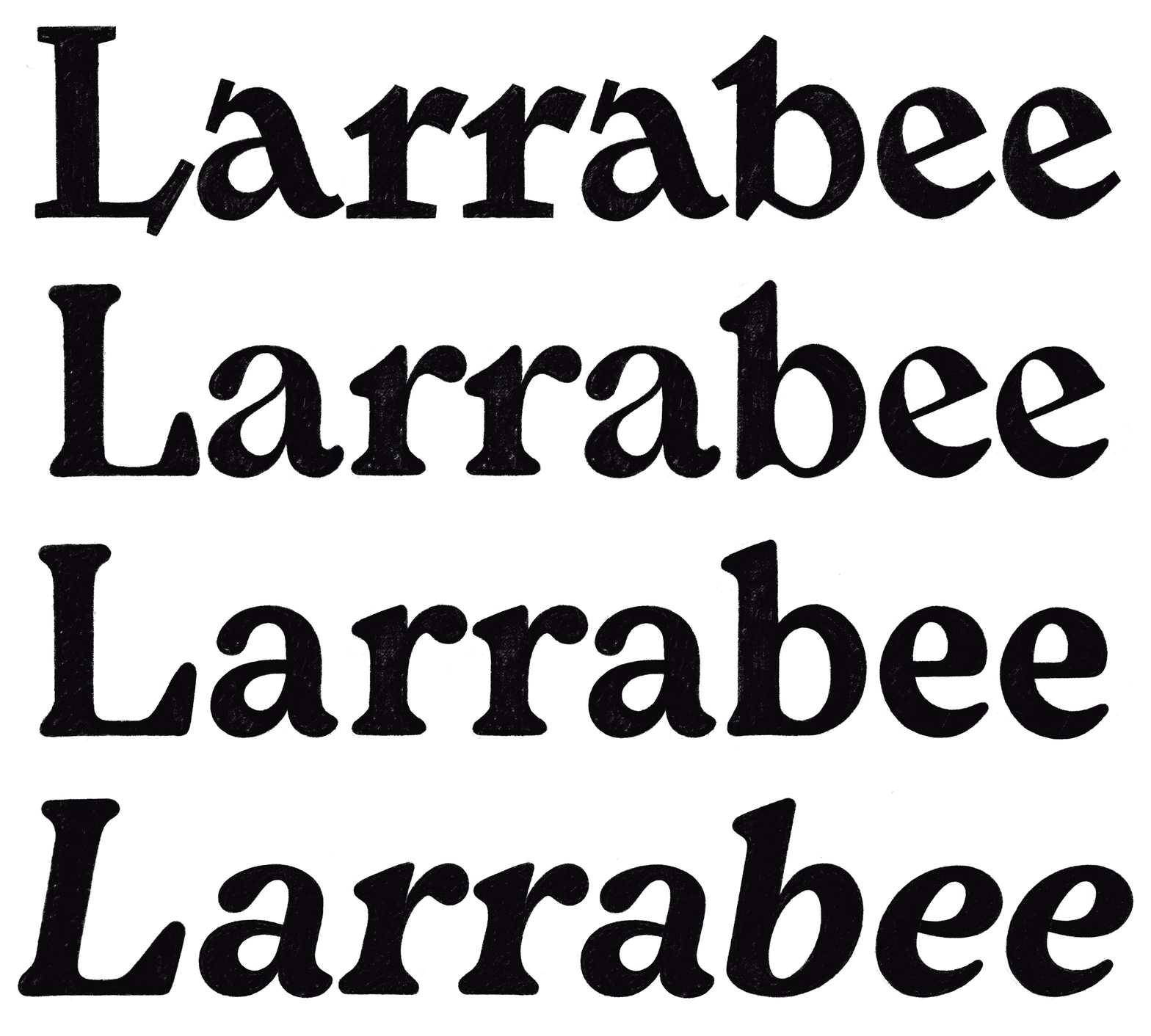
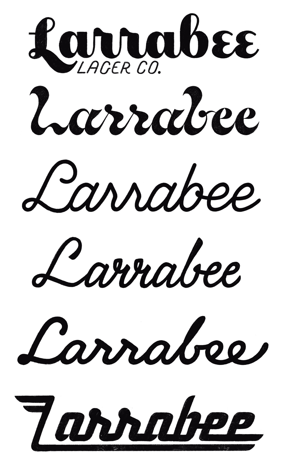
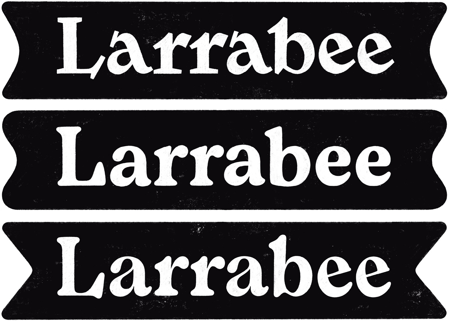
As much as I liked how these romans turned out, the double letters were too clunky and I wasn’t in the mood to resolve them with gaudy swashes. I don’t see myself drawing the next Cooper Black, but I do have a soft spot for these Heinecken-esque gumdrops.
With the exception of the geometric chrome logo, these are the most unlike anything that I had ever drawn before. You can see the first glimmers of something like Gnarthex in th. I especially like the scrunched-up, angular script logo from this batch.
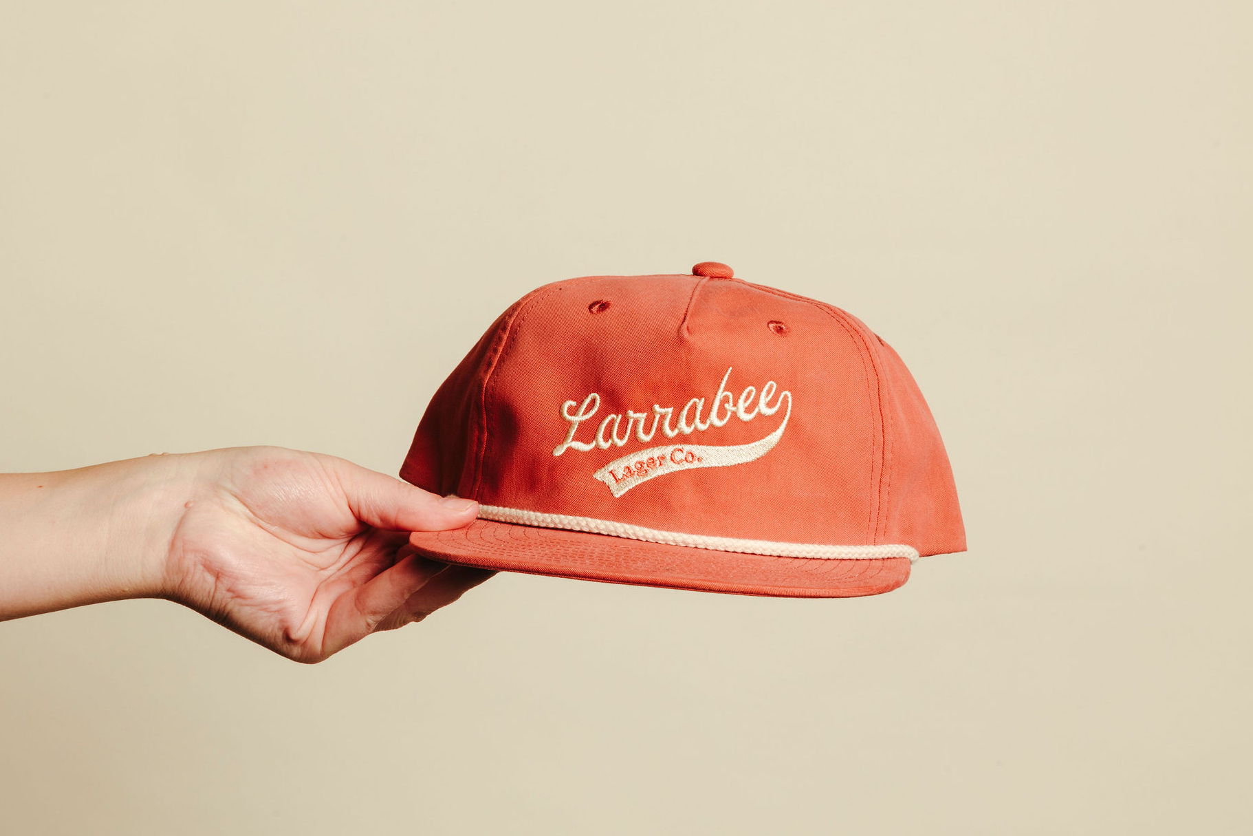
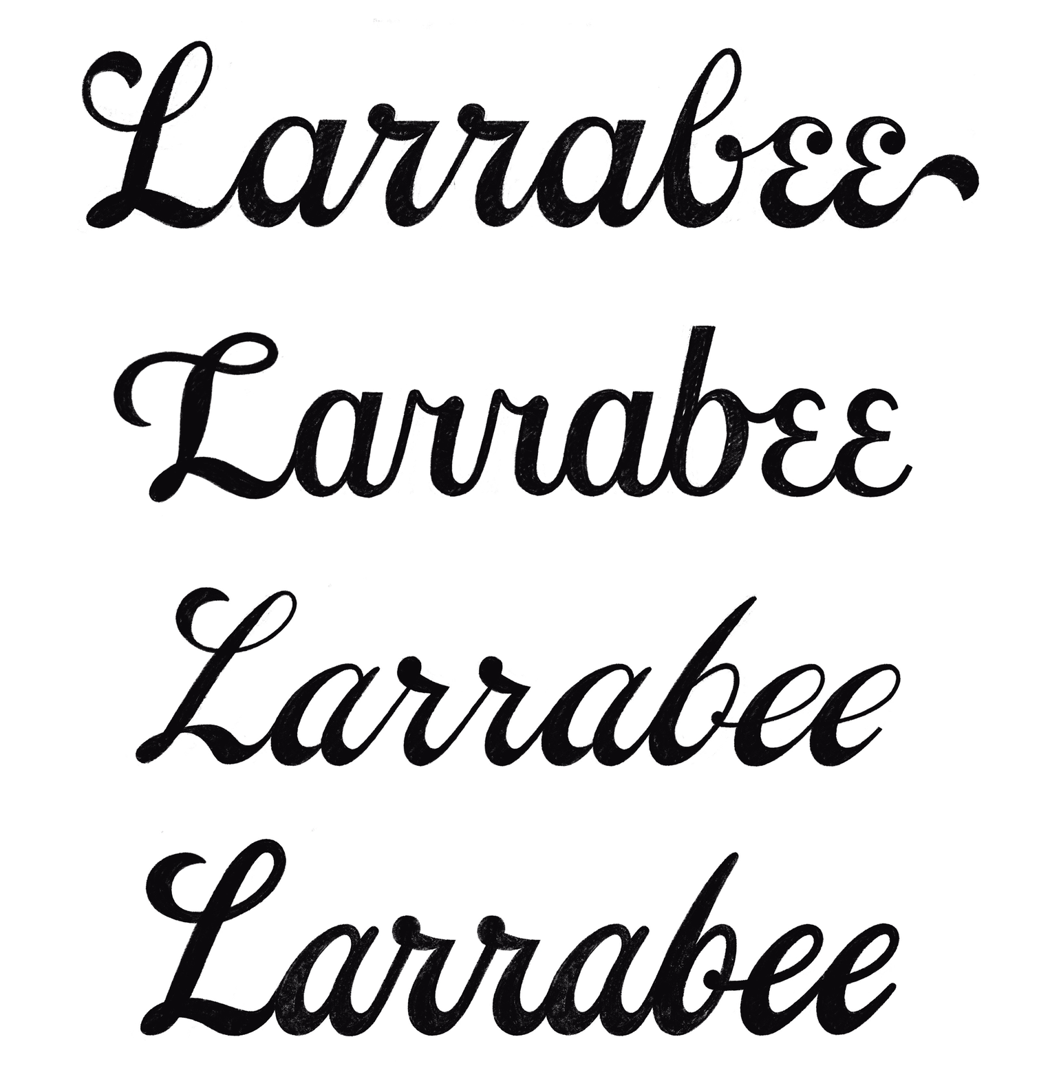
Italian script lettering wasn’t exactly my first choice, but it checks all of the boxes: a little bit of vintage nostalgia, a hint of Americana, and mild sports team vibes. I am also happy with the bean-shaped counters on the ‘a’ and the bottom-heavy weight distribution.