Throughout my time at EsadType, I would reference the Gutenberg Bible to illustrate how gothic script is still relevant to a contemporary type design practice. This image made its way into several presentations, as well as my master’s thesis, but I didn’t stop to take a good look at it until after my writing was finished.
It was February 5, 2025 and I was waiting to present my thesis at the ésad d’Amiens. While sitting in the audience, I was scrolling through visual references from my research. I remember thinking how ironic it was that, for all of the time that I had spent thinking about hybrid gothic type, how little I had studied any historical hybrids. I was studying a high-resolution scan of Fust & Schöffer's ‘Durandus’ 118G—and then this image caught my eye.
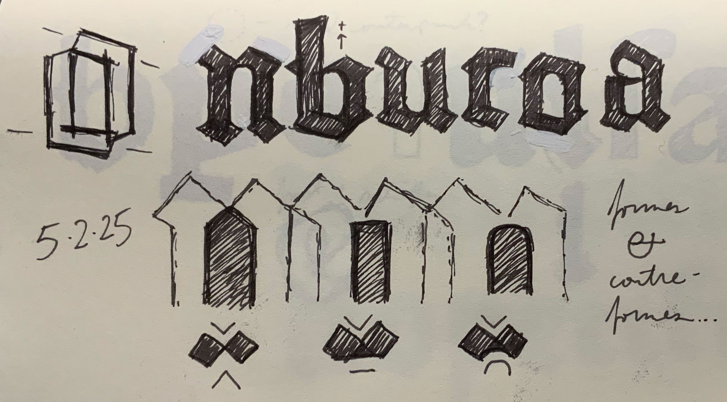
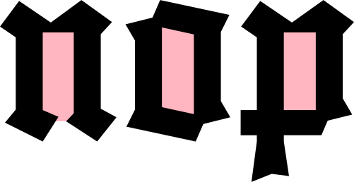
I had seen it dozens of times but, suddenly, I realized that I didn’t really know what was going on. The first thing that occurred to me was that I couldn’t tell how the countershape of the ‘n’ was cut. I always assumed it came to a simple peak, but the effects of printing made me think twice: was it actually pointed, was it flat, or was it arched? It occurred to me that any one of these could be a whole concept in and of itself and I quickly sketched all three, side by side:
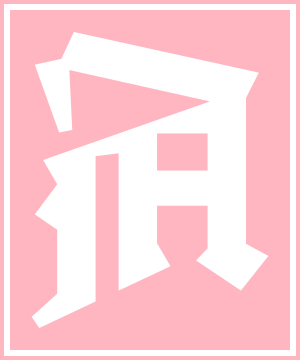
nd the people did feast upon the lambs, and sloths, and carp, and anchovies, and orangutans, and breakfast cereals, and fruit bats...
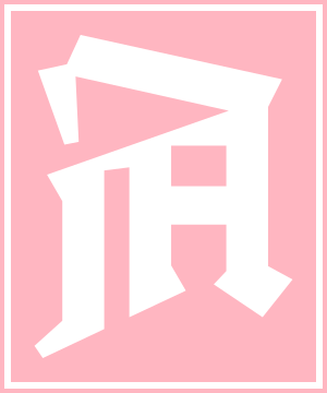
nd the Lord spake,
saying, “First shalt thou take out the Holy Pin. Then shalt thou count to three: no more, no less. Four shalt thou not count, neither count thou two, excepting that thou then proceed to three...”
Fustinberg
→ Type Goblin
You know what the Gutenberg B-42 typeface looks like, right? But do you really? There’s a lot more to it than meets the eye. Technically, it is quite complex, with a plethora of contextual alternates. Stylistically, it is a late-gothic textura par excellence that is ripe for interpretation. This was the genesis of Fustinberg: a digital adaptation Gutenberg, inspired by its unique technical and aesthetic properties.
Did I mention that there are no curves?
What started life as an idle doodle grew to become my first fully-fledged blackletter font. Fitting, that my début Type Goblin release be a tongue-in-cheek tribute to the mother of all typefaces.
Drawing a Gutenberg revival came as a surprise to me. For years, I dismissed the concept as being too basic, too obvious. I guess it depends on how you go about it. Essentially, Fustinberg is a study of 15th-century printing and engraving. It’s also an exercise in constraints. Actually, it’s just a gimmick—but the result is incredibly useful.
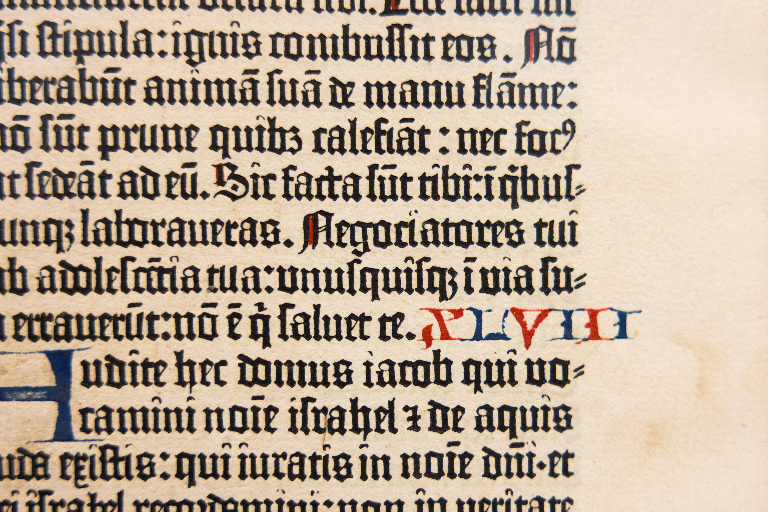
The next thing that I noticed was that the text was peppered with strange, alternate forms: first an ‘r’, then a ‘u’, then an ‘n’. I recalled visiting the Musée de l’Imprimerie de Lyon with TypeParis, where the tour guide explained that—in addition to the ligatures and abbreviations—Gutenberg cast multiple widths of each letter to allow for setting justified text without disrupting the rhythm. Isn’t that fantastic? Not only does the design solve for the justification, but these contextual alternates have an aesthetic of their own. I began to pick out some of these alternate forms and drew them independent of their intended purpose:
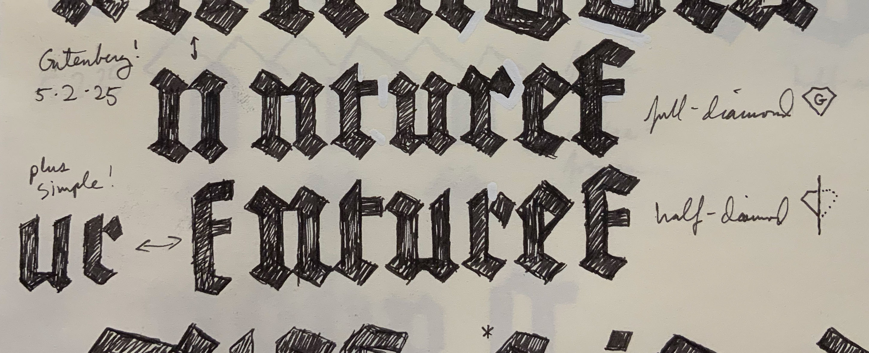
The brutalism of the square countershapes spoke to me. Of the three stylistic directions that perceived, this was the most jarring. I decided to run with it.
These stripped-down alternate shapes reminded me vividly of the Reichsbahnschrift, the iconic lettering of the Berliner S-Bahn. The letters that appeared in front of me were no longer calligraphic: they were synthetic, mechanical, and even perverse in their abstraction.
I had the impression that I wasn't in the 15th century anymore—or was I?
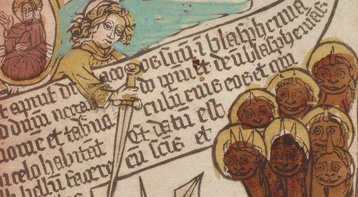
I felt like I had seen these shapes before—and not just in the S-Bahn. I recalled contemporary inscriptions from the Bremen city center, late medieval French jewelery, and also pages such as this one, from the Apocalypsis Sancti Johannis, a German blockbook printed in 1470. You can see how the text was based on writing with a broad nib pen and shaped by the efficiency of engraving the wood block. If you think about it, the Gutenberg Bible was, in a way, a cross between goldsmithing and woodblock printing. Suddenly, my idea doesn’t sound so crazy, does it?
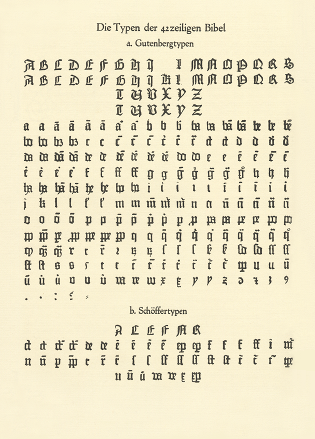
Fortunately, the B-42 is well-documented. Gottfried Zedler even did us the favor of compiling an overview of the glyphset in 1929. This reference was incredibly helpful to have on hand while expanding the design. Most of the lowercase forms were not news to me—but the uppercase was. I could have never imagined shapes like the capital ‘R’, let alone angled letters like the ‘A’ or ‘Y’. It also would have taken me a long time to track down all of the capitals I needed to get a sense of the logic behind the Gutenberg uppercase.
Up until this point, I was unsure of whether I was making a Gutenberg revival or simply a Gutenberg-inspired typeface, but the capitals turned the tables in favor of a revival. I felt underqualified to come up with an original set of capitals on my own. When was the last time that someone made a modern rendition of the B-42 uppercase, anyway? It seemed a shame to throw away such interesting source material.
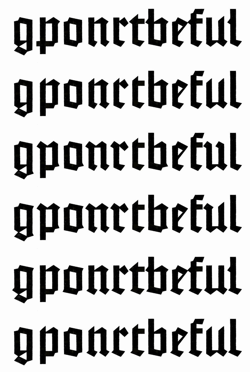
The basic system came together effortlessly. With the core of the lowercase hammered out, I turned my attention to the contextual alternates. It was obvious that I would have to do something to accomodate the lowercase ‘e’, which was crashing into almost everything, including itself. I started out with the most complex solution and removed features one by one, starting with the spurs on ‘f’ and ‘t’. Once I got going, I got a little carried away, deleting features until I was left with a skeleton of my original design. From there, I delighted in randomly adding details back in to create some monstrosities.
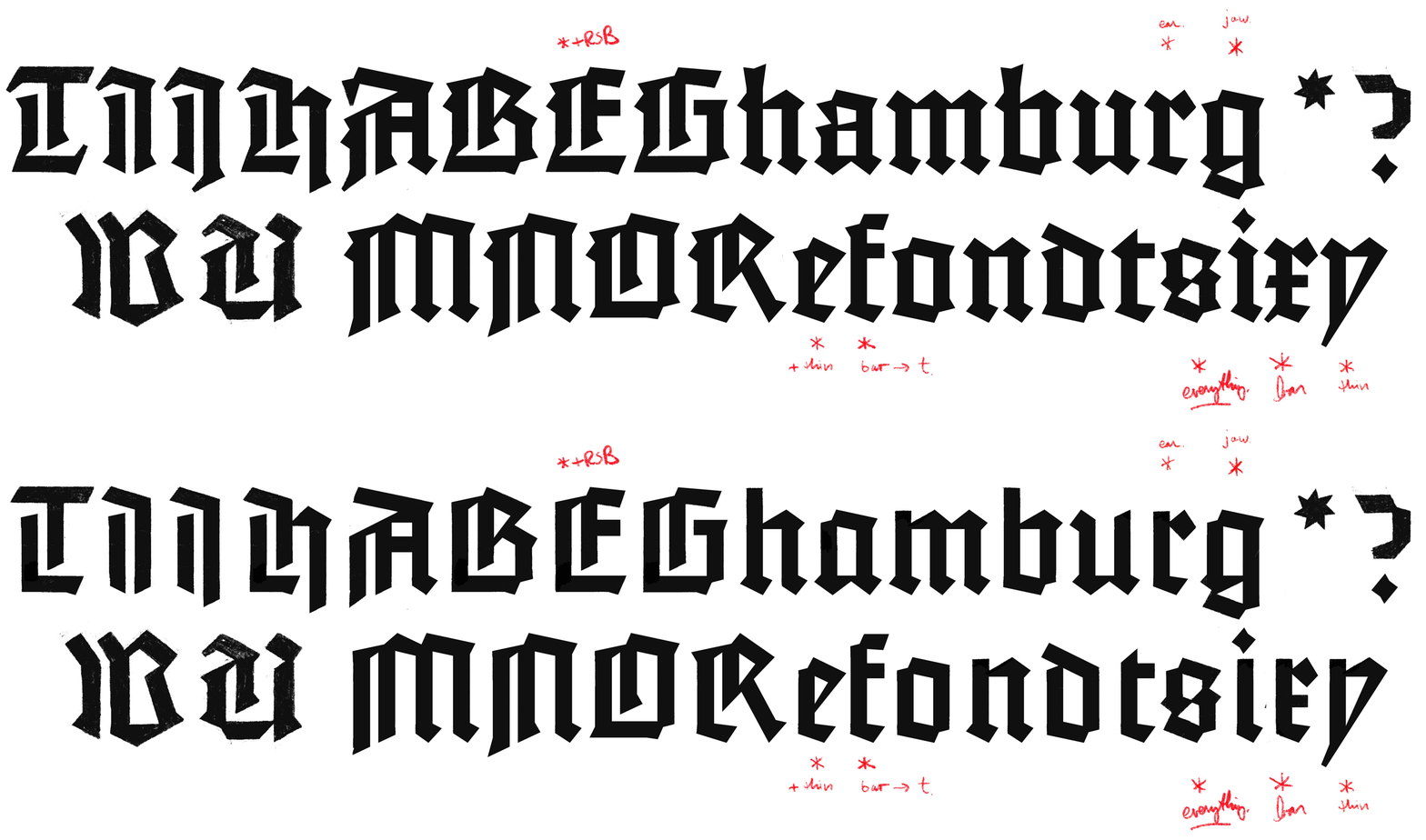
What started off as an exercise in spacing had turned into a stylistic side quest. Once I had committed to the idea of adopting the contextual alternates as a separate stylistic set, the capitals needed to respond. But how? I settled on removing the spurs from the uppercase while leaving the underlying structures intact. I was impressed by how much this superficial alteration affected the texture.
Something missing? Don’t worry: no off-curve points were harmed in the making of this typeface. Around this time, I noticed that I hadn’t used a single curved line segment. It was too late to turn back, even if I knew that a few letters would be stubborn, especially in the uppercase.
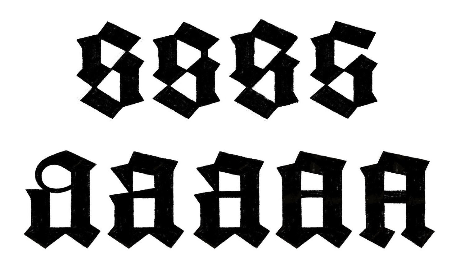
In the lowercase, the ‘s’ and ‘a’ put up the biggest fight. With the ‘s’, it was a question of storytelling: what do I want to say with the letter? I opted to lean into the symmetry and brutalism. With the ‘a’, it was a question of interpretation: of making a traditionally curved shape angular. Of course, there could be more than one solution. Sometimes the most important elements are the ones that you leave out.
At its core, Fustinberg is all about the path of least resistance: straight lines, geometric countershapes, and simplified structures. Everything is stripped down to its essence. Even thin strokes are kept to an absolute minimum in an attempt to createa rugged, crystalline rendering of textura quadrata. When used large, it is excessively mechanical. At small sizes, the angular counters grant it supernatural clarity.

I reduced the elaborate sets of alternates from the 42-line Bible down to a single function: getting the ‘e’ to play nicely with the rest of the alphabet. Thanks to İbrahim Kaçtıoğlu for helping with the feature code!
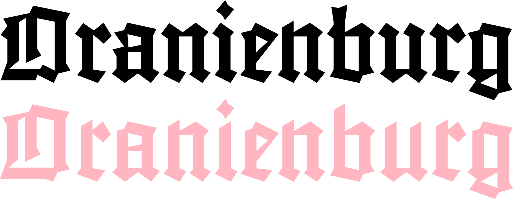
I like it when a design takes on a life of its own. In this case, using the contextual alternates as a stylistic set makes the design look like it was drawn by somebody else. What kind of person would do such a thing?
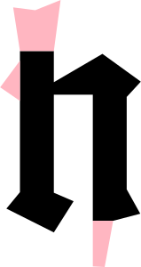
Sometimes reality is stranger than fiction. Very few of Fustinberg’s signature spikes and flanges came from my imagination—the vast majority came straight out of the original type. All I did was dumb them down a little bit. Don’t you just love gothic fonts?
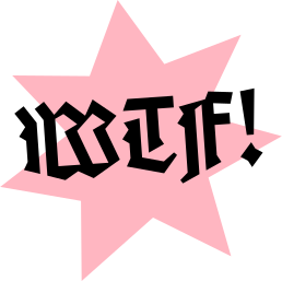
What the Fust? Just because it's blackletter doesn't mean it has to be boring. The capitals are all built so differently from one another that they create a very disjointed texture when used together. I wanted the asterisk to have a little of this unhinged quality and carved a 7-pointed star out of a lump of black pixels. The lightning bolt period is also one of my favorite shapes: it looks like it should have its own sound effect. It stands for ‘wacky textura font.’ Get your mind out of the Gutenberg!